
How to Avoid the "AI-Generated" Look When You Redesign Your Website
- "AI slop" design is the predictable pattern AI coding tools default to: system sans-serif fonts, indigo-to-purple gradient text, floating white shadow cards, and a centered-hero-then-3-column layout.
- The tell is repetition, not any single choice. One shadow card is fine. Every section built from the same shadow card is the tell.
- The fix is not avoiding AI tools. It is directing them: pick the typeface pairing, the palette, and the layout logic yourself, then let AI execute inside those constraints.
- Treat AI as the builder and yourself as the creative director. The tool can lay bricks fast. It cannot decide what the building should feel like.
Open ten landing pages built with an AI coding tool this year and you will see the same page five times. Same system sans-serif. Same indigo-to-purple gradient stretched across the headline. Same floating white card with a soft shadow and rounded corners around every third paragraph. Same centered hero, feeding into a centered three-column grid, feeding into a centered pricing table. Designers have started calling it AI slop: not because any one choice is wrong, but because the pattern repeats itself everywhere, and visitors have started to recognize it on sight. “AI-generated website design” refers to that small set of visual defaults, reached for without explicit creative direction.
None of this is a flaw in the tools. It is what happens when a tool has to guess at taste with no direction. Left to fill in the blanks, an AI coding assistant reaches for whatever is statistically safest, because safe is what it was trained on. A distinctive site only happens when a person with a point of view makes the calls the tool cannot: what this business should feel like, which two typefaces belong in the same sentence, when a shadow earns its place and when it is just filler.
The 4 Tells
These are the patterns that give an AI-built site away at a glance.
- The default font. System sans-serif or Inter, every time, because it is the statistically safest choice for a model with no typeface direction.
- The gradient headline. An h1 that fades from indigo to purple using bg-clip-text and bg-gradient-to-r, regardless of what the brand actually looks like.
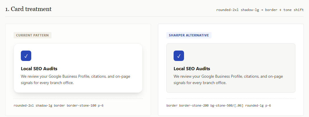
- The floating card reflex. Every idea gets its own rounded-2xl, shadow-lg, white or dark-gray box, whether or not that content needs a container at all.
- The predictable layout. Centered hero, then a centered 3-column feature grid, then a centered pricing table, then a centered footer. Every time.
Generic Default vs. Handcrafted Direction
The difference is not “add more design.” It is replacing an unconsidered default with a choice made on purpose, using the same amount of effort. Color is the clearest example:
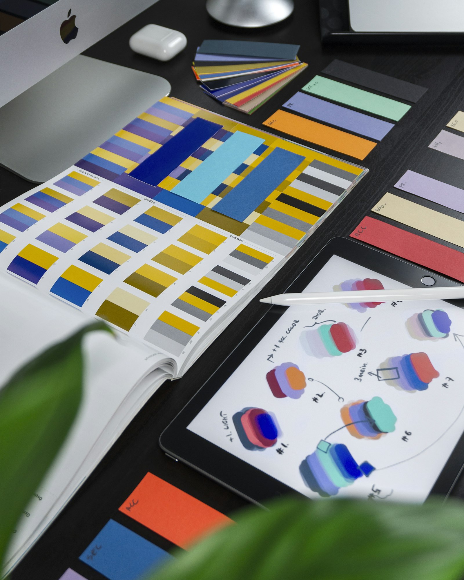
- One intentional accent color, used sparingly, inside a neutral palette that was actually chosen.
- Neutrals with a slight hue bias toward that accent, not a pure default gray.
- No multi-stop gradient smeared across every headline regardless of the brand.
What Changes When a Human Directs It
Same Tailwind toolkit, same amount of code. The difference is which side of each row a person decided on purpose.
| Directed by a human | Left to the default | |
|---|---|---|
| Typography | A deliberately paired display and body typeface, chosen to match the brand, not the model’s training data. | System sans-serif or Inter for every heading and paragraph on the site. |
| Color | One intentional accent color, used sparingly, sitting inside a neutral palette that was actually chosen. | A multi-stop gradient smeared across every headline, regardless of the brand. |
| Containers | A sharp 1px border or a subtle tone shift, used only where a boundary genuinely helps the reader. | Every block of content wrapped in the same rounded, drop-shadowed white card. |
| Layout | An asymmetric grid with an intentional focal point, because the content actually has one. | Centered hero, centered grid, centered pricing table, centered footer, in that order, always. |
AI is the part of the process that can execute quickly. It is not the part that should decide what your business looks like. That call belongs to a human creative director, whether that is you, your designer, or the person running your redesign. Keep a person in that seat and the tool becomes a fast builder working inside a real point of view, instead of the thing quietly setting your brand’s taste for you.
Typography Is the Fastest Single Change
Swapping a default system sans-serif for a deliberately paired display and body typeface changes more visual perception per hour of work than any other fix, and it touches every page at once through a global stylesheet. What that actually looks like in practice:
- A display face and a body face chosen for what they say about the brand, not whichever ships as the default.
- Consistent use across every heading and paragraph, not just the homepage hero.
- Iteration. The first pairing rarely survives contact with real copy, so it gets refined, not shipped on the first guess.
4 Steps to Direct Your Next Redesign
The same moves shown above, in the order to make the calls before an AI tool, or a developer, starts building.
- Pick a type pairing on purpose. Choose a display face and a body face deliberately, for what they say about the brand, not whichever ships as the default.
- Choose an intentional palette. Set one accent color and a neutral scale that was actually selected, not inherited from a starter template.
- Replace shadow cards with real boundaries. Use a container only where content needs one, and reach for a sharp border or tone shift instead of a rounded, drop-shadowed box by default.
- Break the centered grid where it earns it. Let content with a real focal point sit in an asymmetric layout instead of forcing it into another centered 3-column section.
Common Questions
Does an “AI-generated” look actually hurt conversions?
It hurts trust more than it hurts usability. Visitors have seen enough AI-built landing pages now to recognize the pattern, and an established business that looks templated reads as newer or less credible than it is. For a business selling expertise, that mismatch costs you leads before anyone reads a word of copy.
Can I fix this without a full site rebuild?
Usually yes. The four tells of typography, color, cards, and layout are almost always a design-system-level problem, not a content problem. Swapping the font pairing, tightening the palette, and changing one card treatment sitewide can shift the whole feel without touching page structure or copy.
Is it the AI tool’s fault, or how it is being used?
The tool. Left with an open-ended prompt, an AI coding assistant will reach for the statistically safest default, because safe is what it was trained to produce. It only builds something distinctive when a person with a point of view is directing specific choices about type, color, and layout, not just asking for “a modern landing page.”
What is the fastest single change to make?
Typography. Swapping a default system sans-serif for a deliberately paired display and body typeface changes more visual perception per hour of work than any other fix, and it touches every page at once through your global stylesheet.
Redesigning a site that already looks templated? Website redesign services covers what a redesign built around intentional type, color, and layout choices actually involves. If you want the wider picture, mortgage website design covers building it right from the start. Owners maintaining an Astro site can use the Website Owner Guide to make and publish routine changes safely.